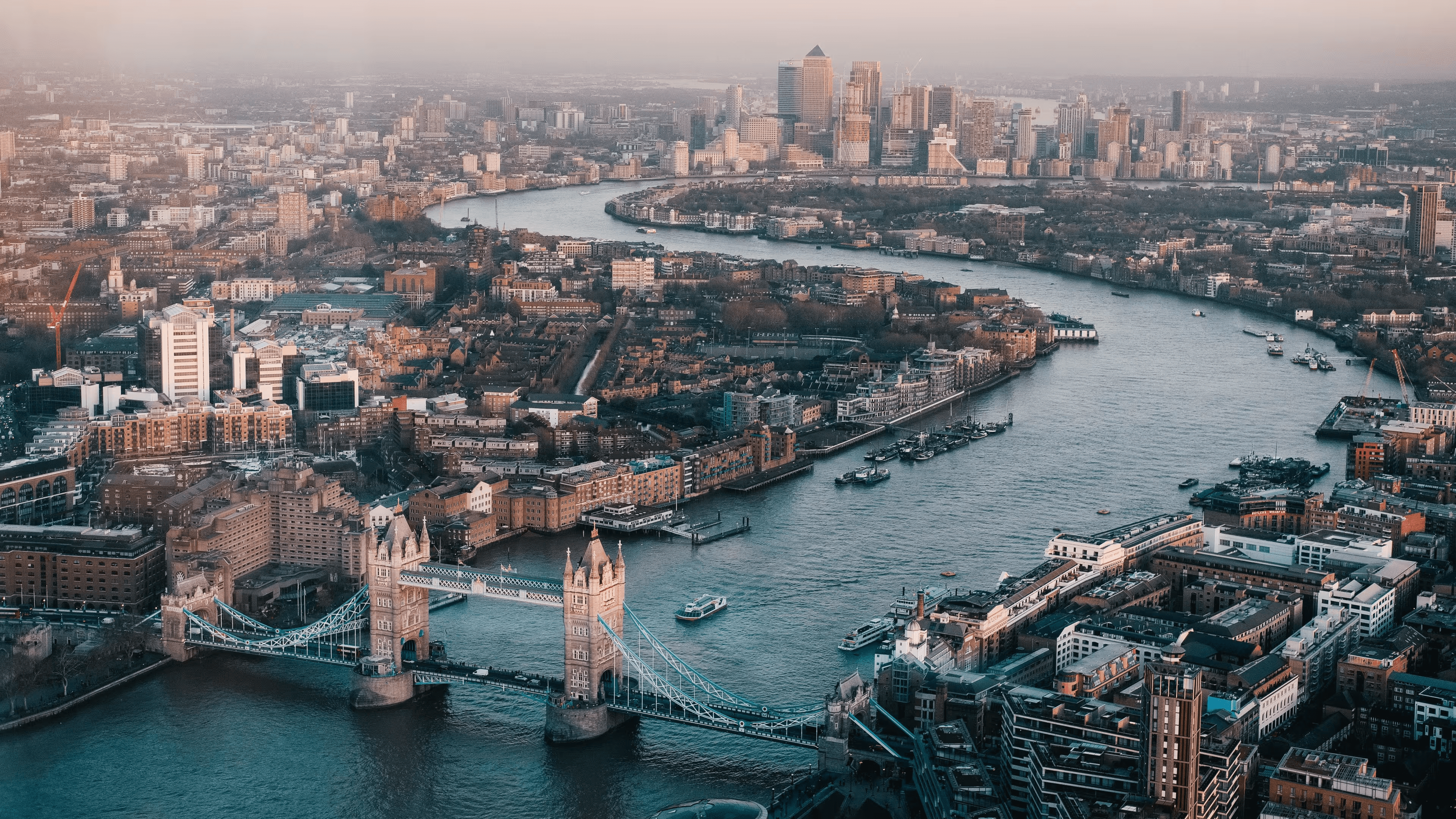


Roam is a waypoint based navigation service designed to tackle the monotony & break the commute mindset in our daily lives.
Roles
Product Design | Service Design
Timeline
6 Months
Tools
Figma, Miro, Gemini, Claude, Google VEO

[PROJECT OVERVIEW]
In a rush? Here's a brief overview of Roam
Urban alienation refers to the feeling of disconnection and isolation that people often experience, particularly in modern cities. This leaves individuals feeling detached from their surroundings and themselves.
Deliberately taking a non-linear path, I immersed myself in deep observational studies to uncover how we experience the cities we live in. What I found was a deep-rooted 'commute mindset,' where efficiency and the endless distraction of our screens quietly take away from the joy of discovery. Tackling this behaviour became the core challenge of the project.
Taking a whimsical approach & designing a new waypoint-based navigation service, I proposed a concept app which aims to break the monotony and change how we explore our cities. Roam prioritises experience over efficiency by gently encouraging people to serendipitous discoveries and form authentic connections, and invites us to look up from our screens.
[MY PROCESS]

[CONCEPTS IN FOCUS]
I started my journey by exploring these concepts
[RESEARCH & DISCOVERY]
Findings From the Research Phases
The Core Issue
Urban Alienation
Cities are built for speed, not connection. This turns our vibrant neighbourhoods into places we simply rush through, rather than places we truly experience.
The Commute Mindset
To get through the daily grind, we walk the exact same routes every single day. It becomes such a monotonous routine that we switch to autopilot and stop noticing our surroundings altogether
Sense of Belonging
Living close to people doesn’t automatically mean you feel part of a community. People genuinely want to feel rooted in their neighborhoods, rather than just feeling like strangers who are passing through
Screens Keep Our Heads Down
Traditional navigation apps focus on efficiency over exploration & keep us staring at a blue dot on our phones instead of encouraging us to look up and experiencing the city around
We Lost The Joy of Getting Lost
Because our daily routines are so planned out and hyper-efficient, we leave little to no room for stumbling upon hidden gems or for "getting lost" in our surroundings
[PROTO PERSONA]
Meet Serena

[IDEATION WORKSHOPS]
CO-DESIGN WORKSHOPS

Storyboarding
Feature Ideation
Touchpoints Ideation
User Journey Mapping
Concept Ideation
MoSCoW
10
Participants
Workshop
What We Did
Generated a broad range of potential concepts & ideas directly based on user needs & desires, ensuring relevance. Efficiently prioritised ideas & concepts using the MoSCoW grid for effective decision-making
We then efficiently prioritised ideas & concepts using the MoSCoW grid for effective decision-making
[PROTOTYPE TESTING]
Lo-Fi Prototype Testing


Experiential Testing
Concept Testing
Qualitative Testing
1-to-1 Design Critique
3
Participants
Workshop
Findings & Insights
Tested whether users actually embraced the waypoint navigation concept before investing time in high-fidelity visual design
Identified which UI cues encouraged looking up at the city rather than down at a screen
Observed if this concept created feelings of curiosity or anxiety when users were put on unfamiliar paths
A tangible postcard in the mail created a much stronger nudge to break routine than an easily dismissed phone notification
[ROAM]
Key Features


[PROTOTYPE TESTING]
Hi-Fi Prototype Testing

Experiential Testing
Concept Testing
Qualitative Testing
1-to-1 Design Critique
3
Participants
Workshop
Findings & Insights
Users appreciated the subtle guidance cues and acknowledged that it would help reduce distractions
The postcard concept resonated deeply, enhancing tangibility and connection
Qualitative analysis allowed me to get valuable insights, from the users, on the integration of features & touchpoints
For my concept behind designing Roam, understanding the users’ thoughts and feelings when navigating using Roam
Post the testing sessions I made UI changes that the users suggested could improve the experience
[BUSINESS MODEL]
Roam

[TAKEAWAYS & LEARNINGS]
My Takeaways
I learned that the UX process isn't a rigid, linear checklist. By starting with abstract concepts, I let the problem of urban alienation naturally, lead me to a more original and impactful solution
My experience with AI was about augmentation, not automation. Using it to analyse data & refine prompts helped me become a more precise visual storyteller and designer
My process was driven by continuous user feedback. Co-ideation workshops and prototype testing justified the major design choices I made through the design process
This project taught me to design holistically, going beyond a single app to thinking about the ecosystem. I also learned to think about all the physical and digital touchpoints that make up a service
My non-traditional approach taught me to be comfortable with ambiguity. I learned that allowing a problem to emerge organically, rather than forcing a solution, can lead to more innovative and meaningful work
[TAKEAWAYS & LEARNINGS]
What I'd Do Differently
Inclusive Roaming
Wandering should be for everyone. I’d love to refine how the app suggests routes, ensuring these unplanned adventures are safe and accessible regardless of physical ability
Whimsical UI Design
I’d push the visual design further & add playful micro-interactions would make the digital screen feel just as magical and whimsical
Interviewing people mid-commute
I’d love to intercept people right in the middle of their daily rush & asking them about their commute habits. Capturing the raw, unfiltered 'commute mindset' in real-time could have led to even stronger insights